Booking App
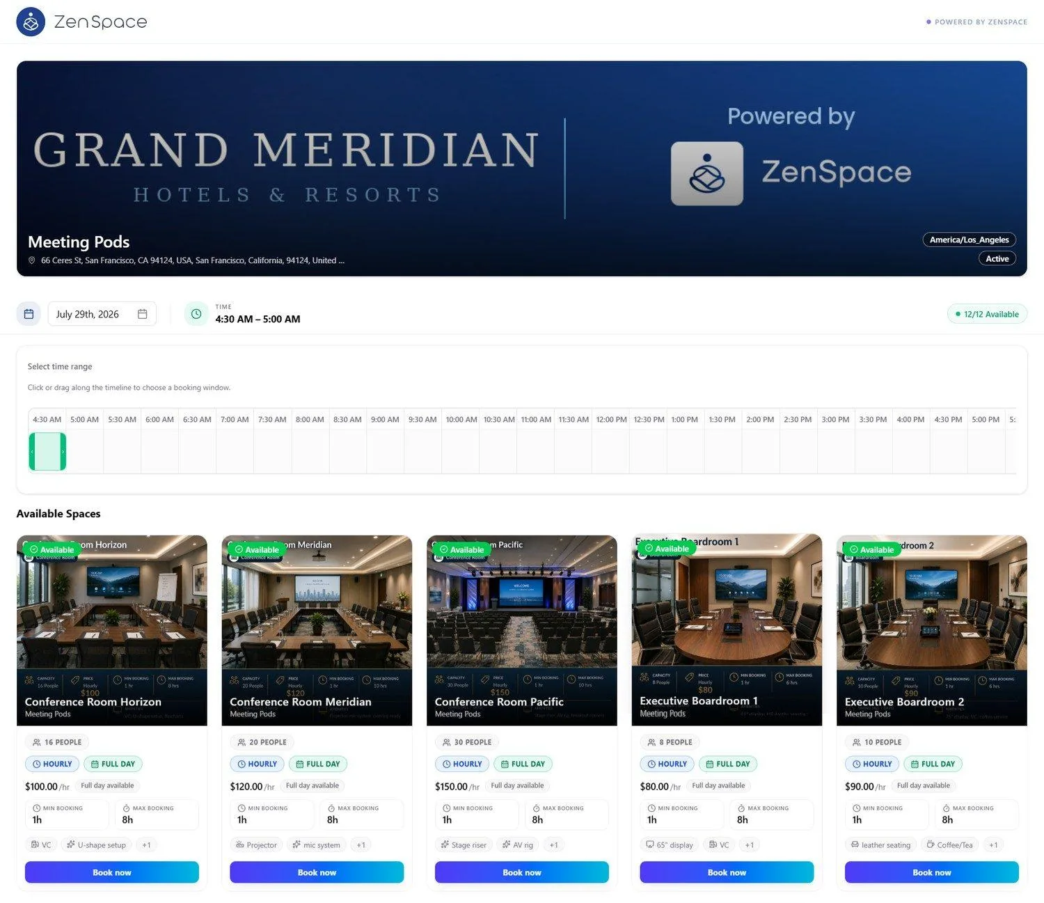
📸 Browse & Discovery Page
Public group landing page for the booking app. A banner carries the organization’s branding alongside Powered by ZenSpace, with the group name, address, timezone, and an Active status chip beneath it. Below the banner sit a date picker, the selected time range, and a count of how many spaces are available for that window.
Select time range presents a half-hourly timeline that can be clicked or dragged to choose a booking window. Available Spaces then lists the matching spaces as cards, each showing an availability badge, capacity, Hourly and Full Day badges, the hourly rate with a full-day note, minimum and maximum booking duration, amenity chips with a +N overflow, and a Book now action. Route: /booking/:org/:group
📸 Space Booking Page
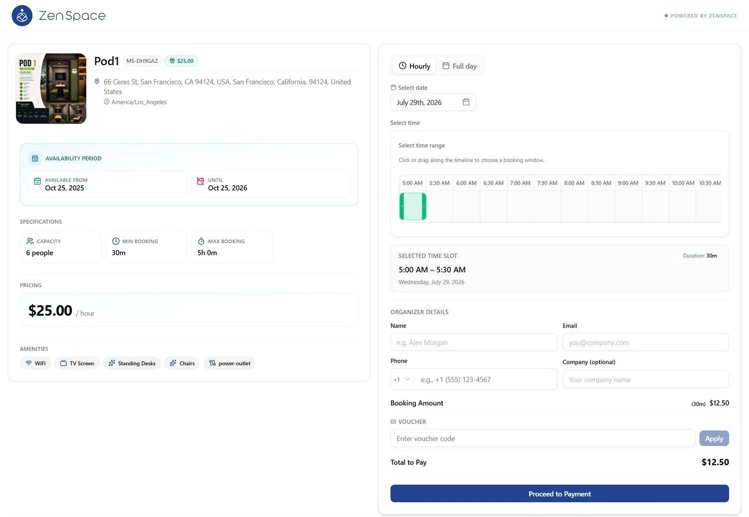
Individual meeting space booking page. The left panel presents the space thumbnail, the space name with its space code and price badge, the address and timezone, an Availability Period panel (Available From / Until), Specifications (Capacity, Min Booking, Max Booking), the hourly Pricing, and the Amenities chips.
The right panel drives the booking. An Hourly / Full day toggle sets the mode, Select date picks the day, and Select time range presents a timeline that can be clicked or dragged to choose a window; the chosen window is then confirmed in a Selected Time Slot panel showing its duration and date. Organizer Details collects Name, Email, Phone behind a country-code selector, and an optional Company. Beneath that, the Booking Amount is shown against the selected duration, a voucher code can be entered and applied, and Total to Pay updates before Proceed to Payment. Route: /booking/:org/:group/:space
📸 Payment Page
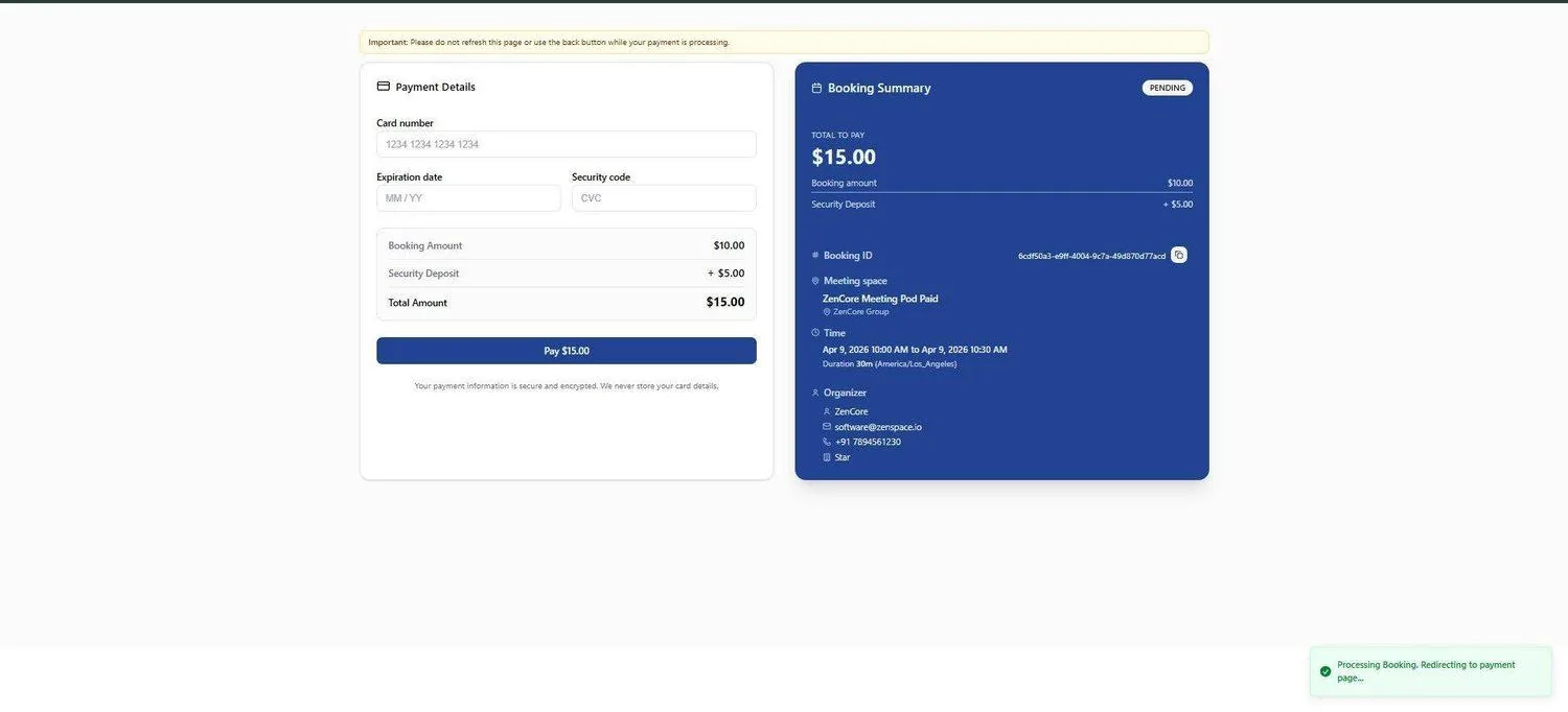
Stripe payment form. Left panel: card details (number, expiry, CVV), amount breakdown ($10 + $5 = $15), Pay $15.00 button. Right panel: Booking Summary (Booking ID, Meeting Space, Time, Duration, Organizer details). Route: /booking/payment
📸 Booking Confirmation
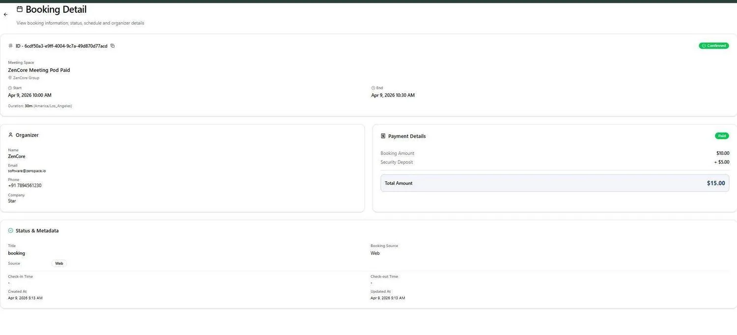
Post-payment booking detail page. Booking ID confirmed, Meeting Space: ZenCore Meeting Pod Paid / ZenCore Group. Start: Apr 9, 2026 10:00 AM, End: 10:30 AM (30 min). Payment Details: $10.00 + $5.00 security deposit = $15.00 total. Route: /booking/details/:id
View Availability
📸 View Space Availability
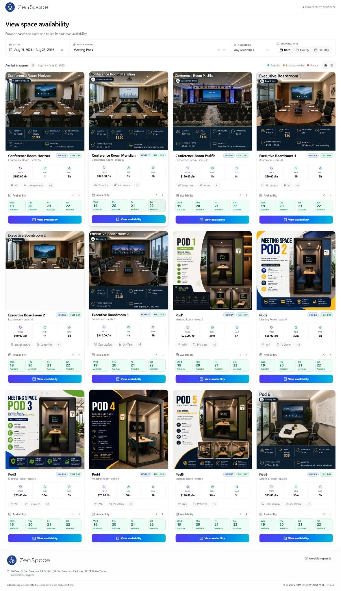
Public View Availability page (opened from a group’s Booking Links) where visitors browse spaces and open one to see its slot-level availability. The filter bar carries four controls: Dates (a clearable date range), Space Group, Amenities, and Booking Type — Both / Hourly / Full day. Below the filters, the Available spaces heading shows the result count and the active date range, followed by a status legend (Available / Partially available / Booked) and a view toggle that switches between card and list layouts.
📸 View Space Availability — Filters
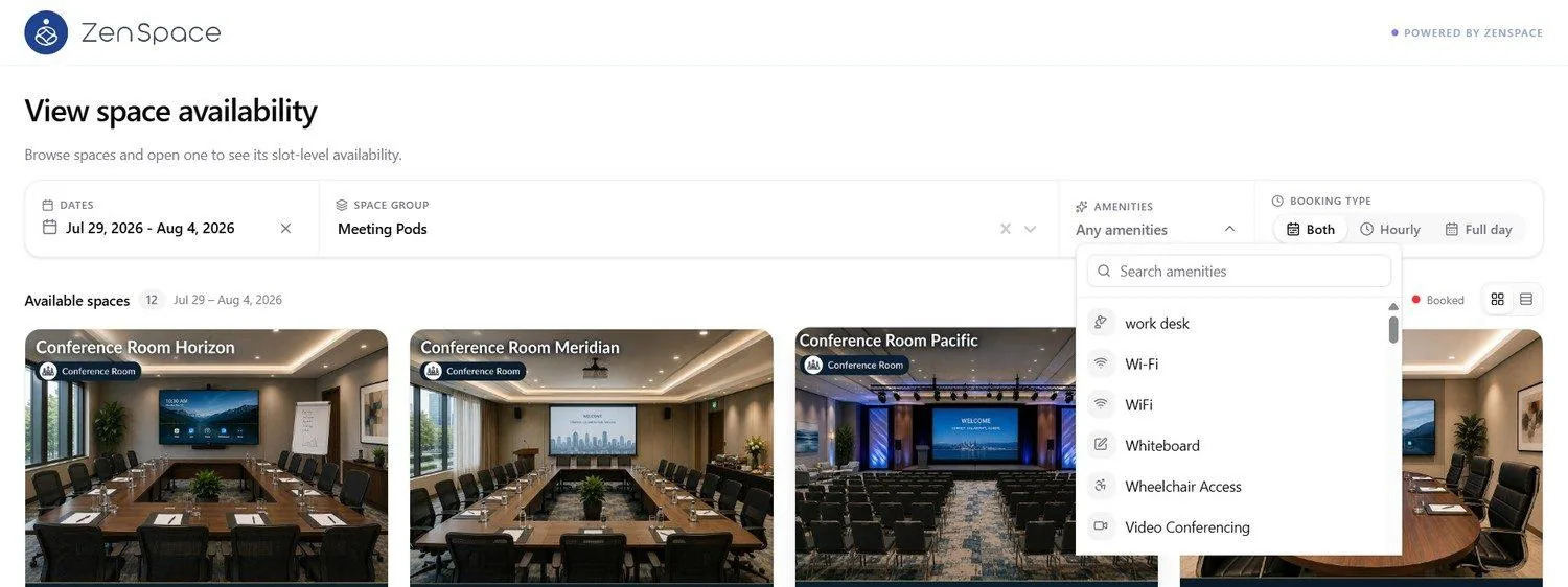
Opening the Amenities filter reveals a searchable list of the amenities configured for the organization; selecting one or more narrows the results. Dates and Space Group each carry a clear (×) control, and Booking Type is a segmented control — Both, Hourly, or Full day — used to restrict results to spaces that offer that booking mode.
📸 View Space Availability — Card View
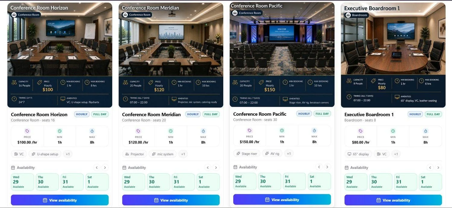
In card view each space is presented as a card: a photo carrying the space name and space-type badge, a dark summary strip (Capacity, hourly Price, Min Booking, Max Booking, Timing, and Amenities), then the space name with its Hourly and Full Day badges, the space type and seat count, and Price / Min / Max tiles. Amenity chips follow, with a +N chip for any that overflow.
The Availability strip shows the status of four days at a time, colour-coded Available, Partially available, or Booked. The ‹ › arrows immediately above the View availability button step that four-day window backward and forward through the selected date range. View availability opens the space’s slot grid.
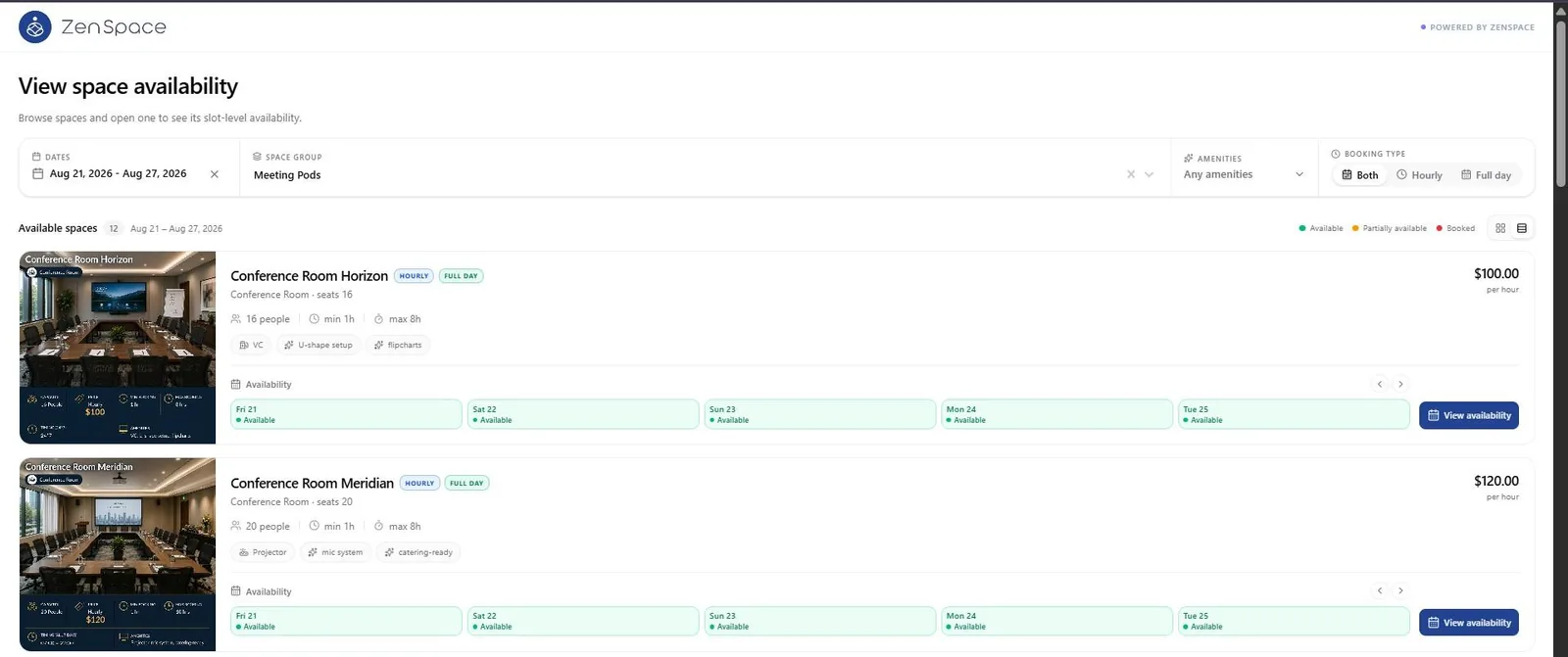
📸 View Space Availability — List View
Switching to list view with the view toggle presents the same spaces as full-width rows. Each row carries a thumbnail, the space name with its Hourly and Full Day badges, space type and seat count, capacity with minimum and maximum booking duration inline, amenity chips, and the hourly rate at the right.
The Availability strip in list view shows five days at a time rather than the four shown in card view, using the same ‹ › arrows to move through dates, with the View availability button at the end of the row.
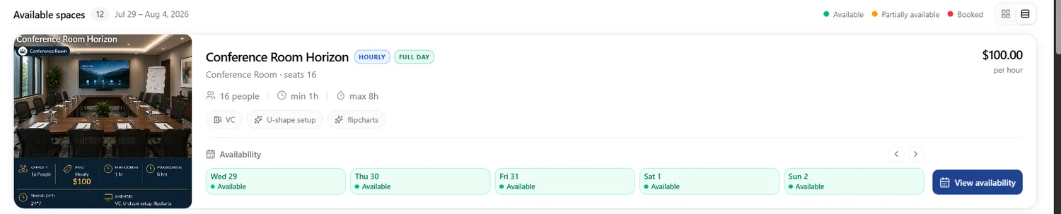
📸 View Space Availability — Availability Strip and View Toggle
Close-up of a list row. The card / list view toggle sits at the top right alongside the status legend. Day tiles are colour-coded — green for Available, amber for Partially available, red for Booked — and the ‹ › arrows beside the Availability label move the visible day window through the selected date range.
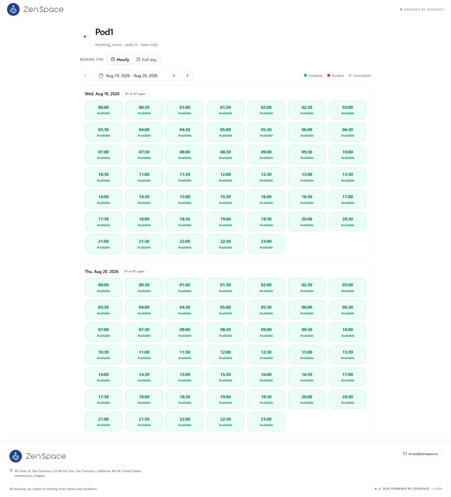
📸 View Space Availability — Slot Grid
Opening a space shows its read-only slot grid. The header carries a back arrow, the space name, and a subtitle confirming space type, seat count, and view-only mode. A Booking Type toggle (Hourly / Full day) is available on this screen as well as on the browse page, so availability can be checked in either mode. Beneath it sit a date-range navigator with ‹ › arrows and a clear control, and a legend for Available / Booked / Unavailable.
Each day in the selected range is a separate section headed by the date and an open-slot counter (for example, 47 of 47 open), followed by half-hour slots running across the day. Slots are display-only here — no booking action is offered on this page.
Request Spaces
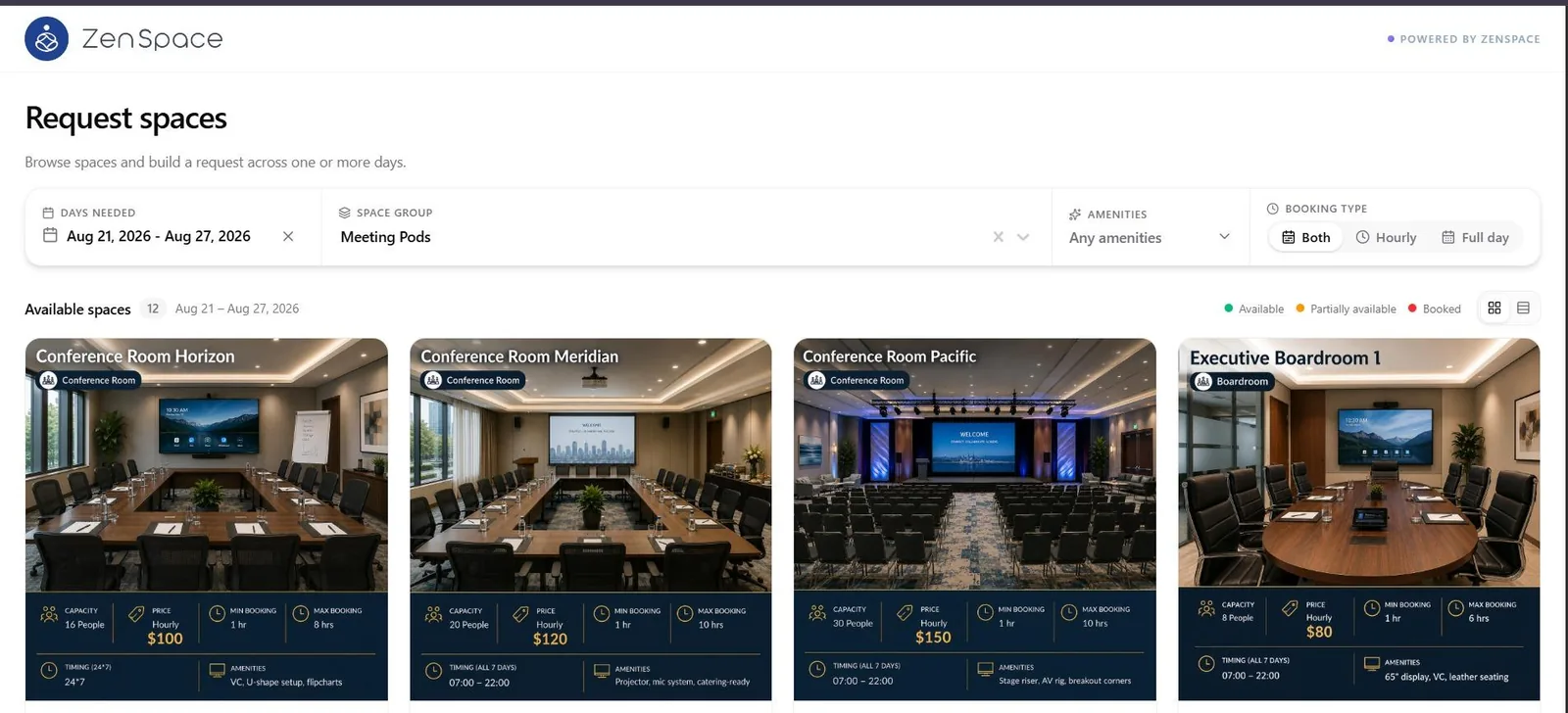
📸 Request Spaces — Browse
Public Request Spaces page where visitors browse spaces and build a request spanning one or more days. The filter bar matches View Availability except that the date control is labelled Days Needed: Days Needed (a clearable date range), Space Group, Amenities, and Booking Type — Both / Hourly / Full day. Below the filters, the Available spaces heading shows the result count and active date range, followed by a status legend (Available / Partially available / Booked) and the card / list view toggle.
📸 Request Spaces — Filters
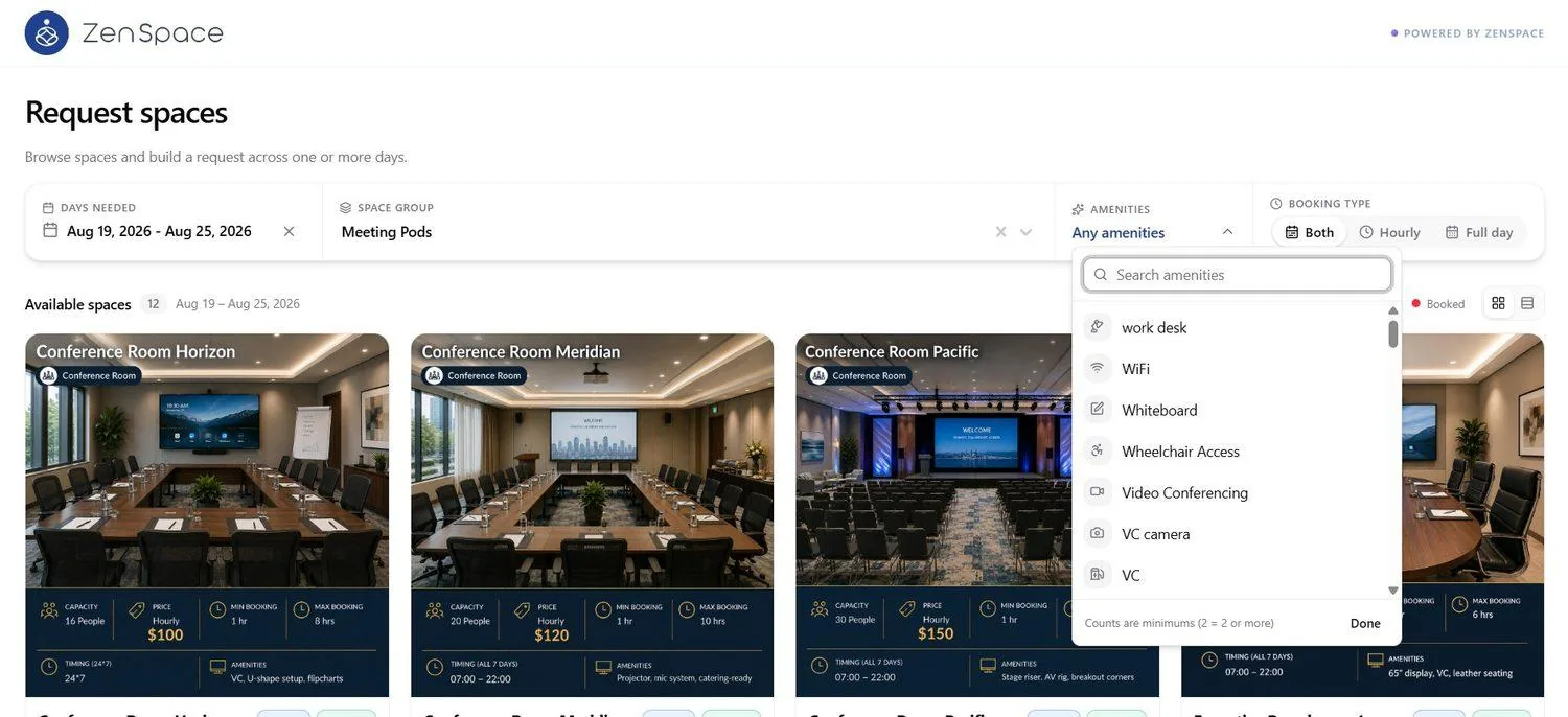
The Amenities filter opens a searchable list of the amenities configured for the organization. A footer note explains that counts are treated as minimums (2 = 2 or more), and Done closes the picker. Booking Type restricts results to spaces offering that mode, and Days Needed and Space Group each carry a clear (×) control.
📸 Request Spaces — Days Needed Date Picker
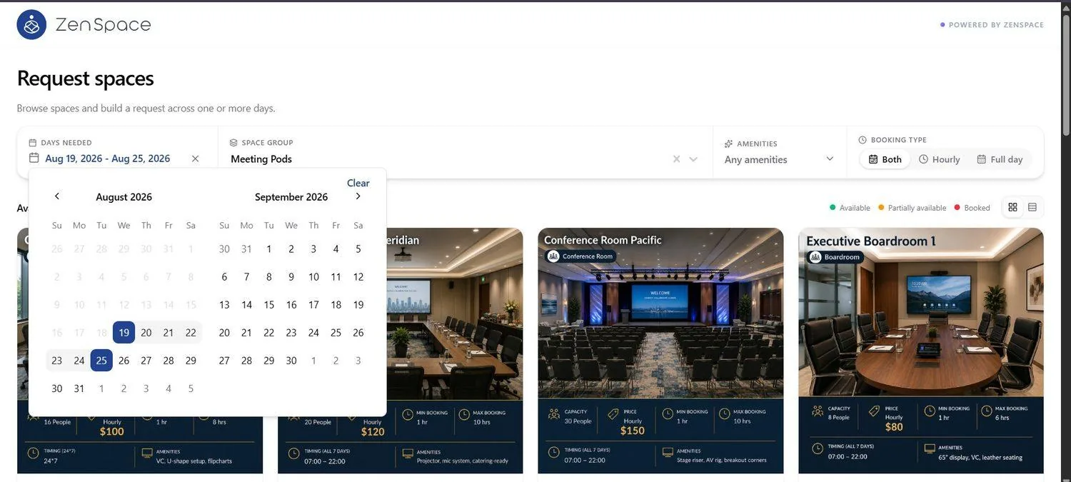
Opening the Days Needed control shows a two-month calendar for picking the date range; selected days are highlighted, a Clear link resets the range, and ‹ › arrows step between months.
📸 Request Spaces — Space Group Selector
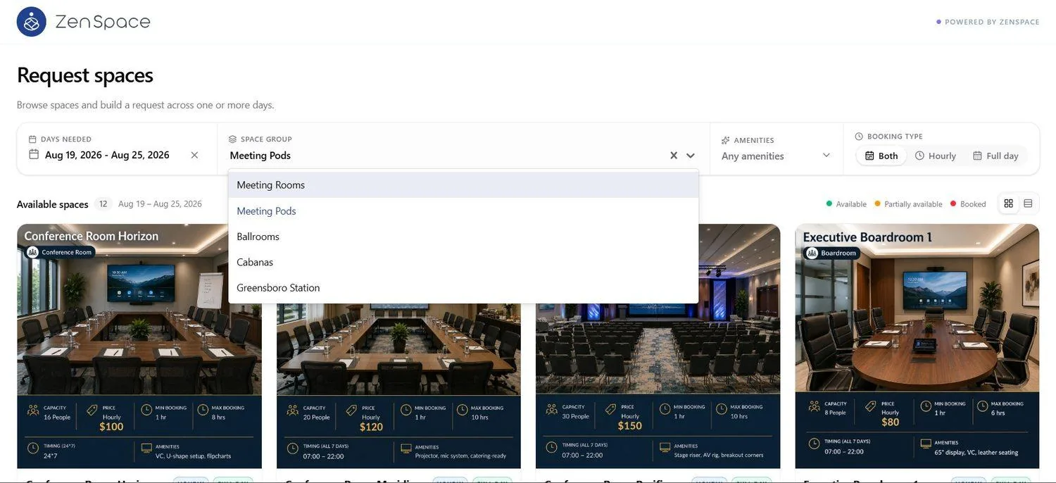
The Space Group control opens a list of the organization’s groups (e.g., Meeting Rooms, Meeting Pods, Ballrooms, Cabanas, Greensboro Station); the active group is highlighted, and choosing one filters Available spaces to that group.
📸 Request Spaces — Card View
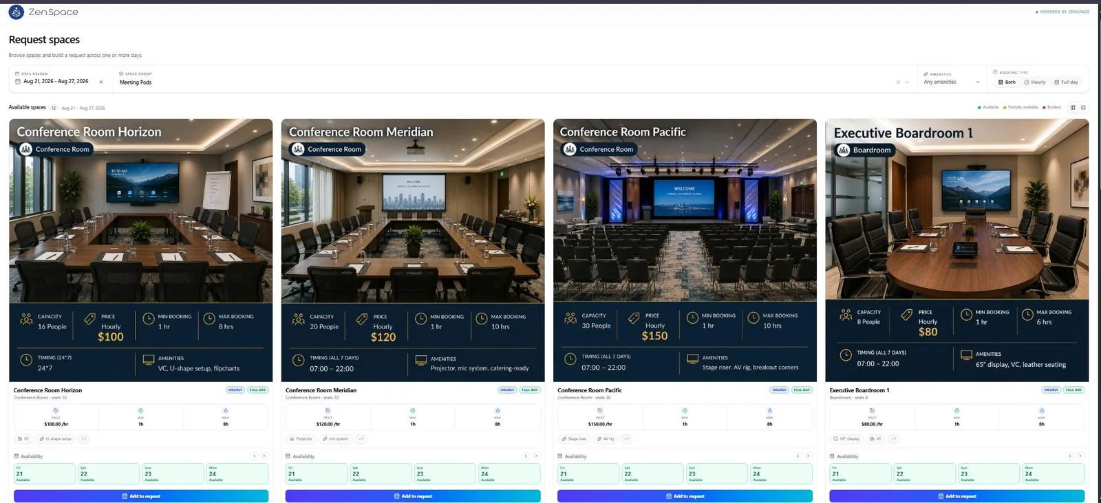
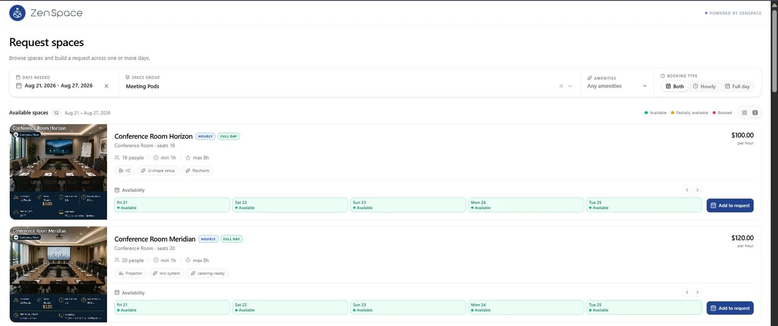
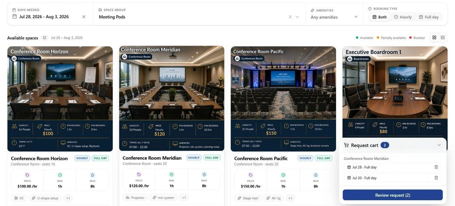
Card view uses the same card anatomy as View Availability — photo with space name and type badge, dark summary strip, Hourly and Full Day badges, Price / Min / Max tiles, and amenity chips — but the primary action is Add to request rather than View availability. The Availability strip shows four days at a time, with the ‹ › arrows above the button stepping through dates.
A space may appear with a single booking-type badge only. Pod6 here carries FULL DAY alone, and its Price tile reads Full day in place of an hourly rate.
📸 Request Spaces — List View
Switching to list view presents the spaces as full-width rows: thumbnail, space name with its Hourly and Full Day badges, space type and seat count, capacity with minimum and maximum booking duration inline, amenity chips, and the hourly rate at the right. As on View Availability, the list Availability strip shows five days at a time rather than four, and Add to request sits at the end of each row.
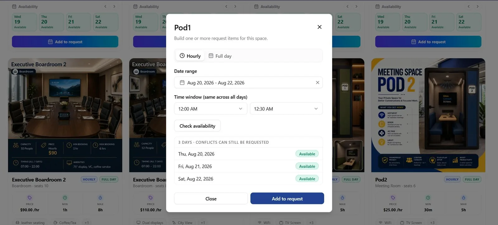
📸 Request Spaces — Request Builder: Hourly Mode
Selecting a space opens the request builder for that space, with Hourly and Full day tabs. Hourly mode takes a Date range and a single Time window applied across all days, then Check availability returns a per-day result list.
The results panel is headed with the number of days covered and a note that conflicts can still be requested; each day carries its own status badge. Close discards the builder, while Add to request adds the items to the request cart.
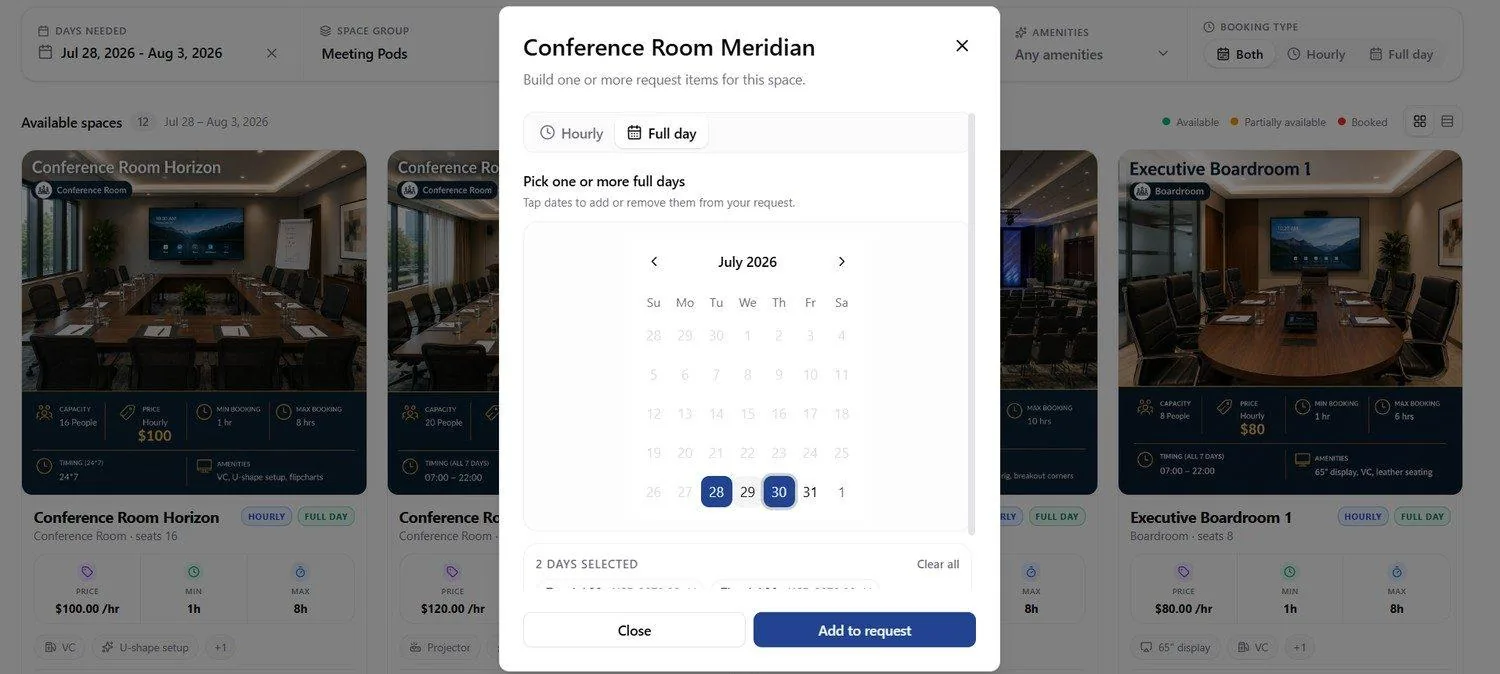
📸 Request Spaces — Request Builder: Full Day Mode
Full day mode replaces the time window with a month calendar — tapping dates adds them to or removes them from the request. Selected dates are highlighted, and a summary beneath the calendar reports how many days are selected alongside a Clear all action. With no dates selected, Add to request stays disabled; once at least one day is picked it adds one full-day item per date.
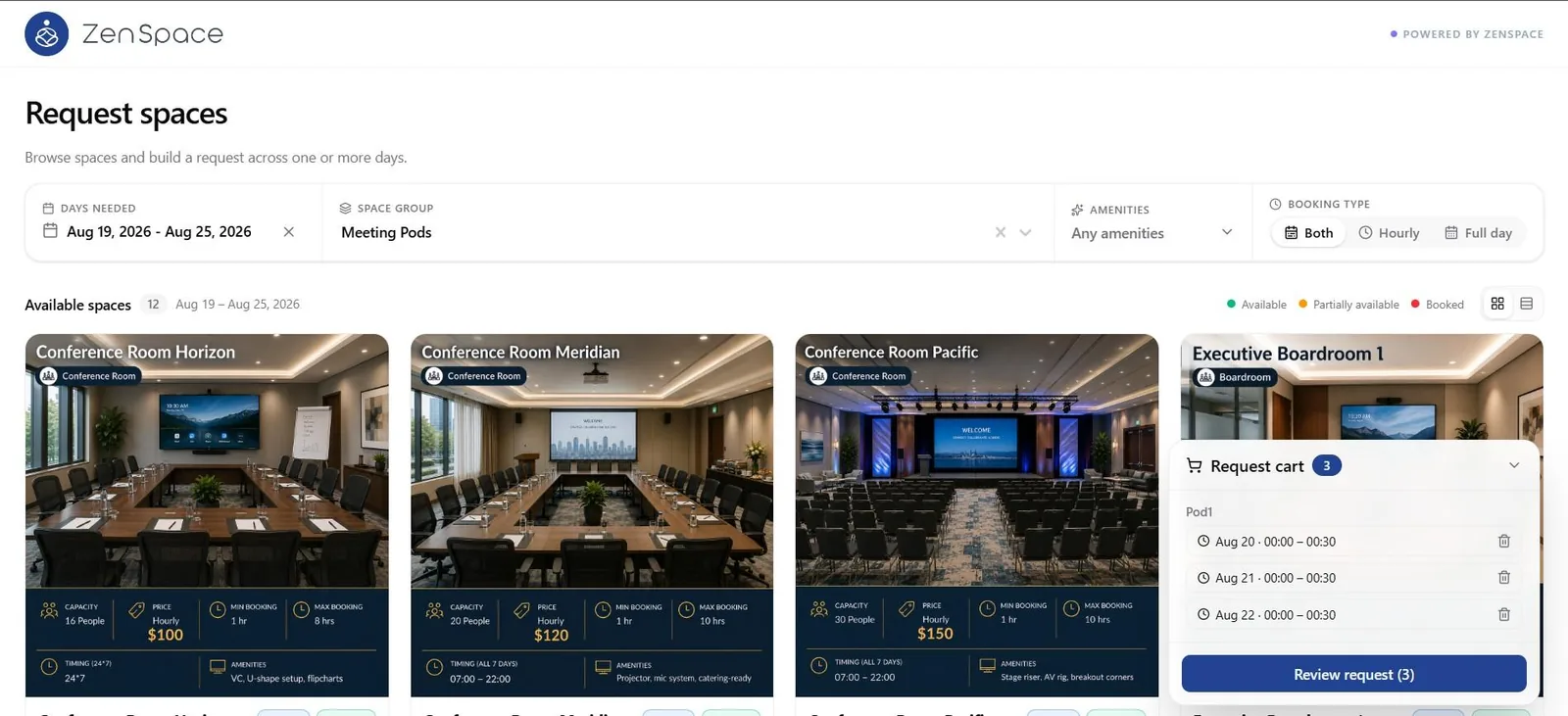
📸 Request Spaces — Request Cart (Hourly)
Added items collect in the Request cart widget, which shows a running item count and can be collapsed. Items are grouped under their space — so a single request can span more than one space — and each entry lists its date and time window with a delete action. Review request carries the total item count and moves to the review screen.
📸 Request Spaces — Request Cart (Full Day)
The same cart holding full-day items: each entry shows its date labelled Full day in place of a time window. The cart stays available over the browse page, so further spaces and dates can be added before the request is reviewed.
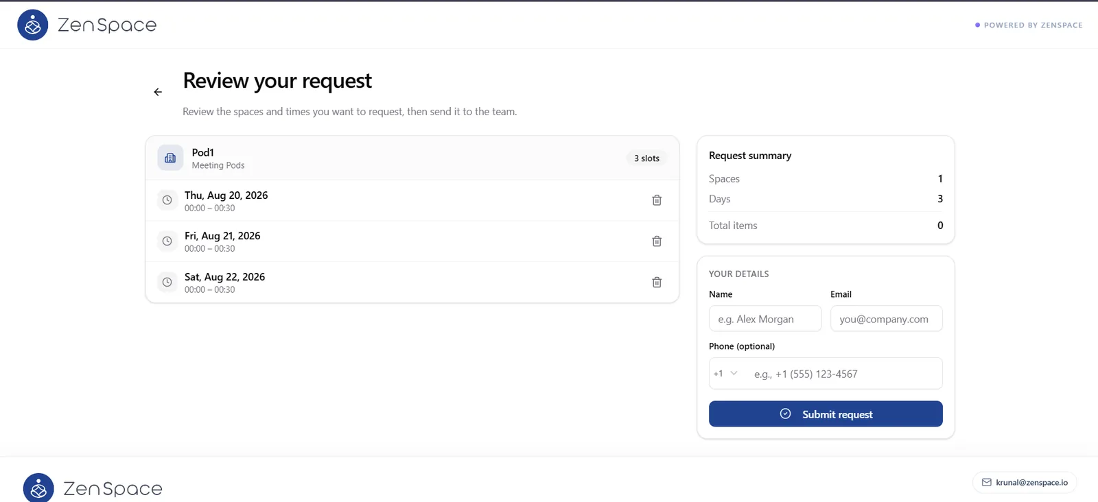
📸 Review Your Request — Hourly Items
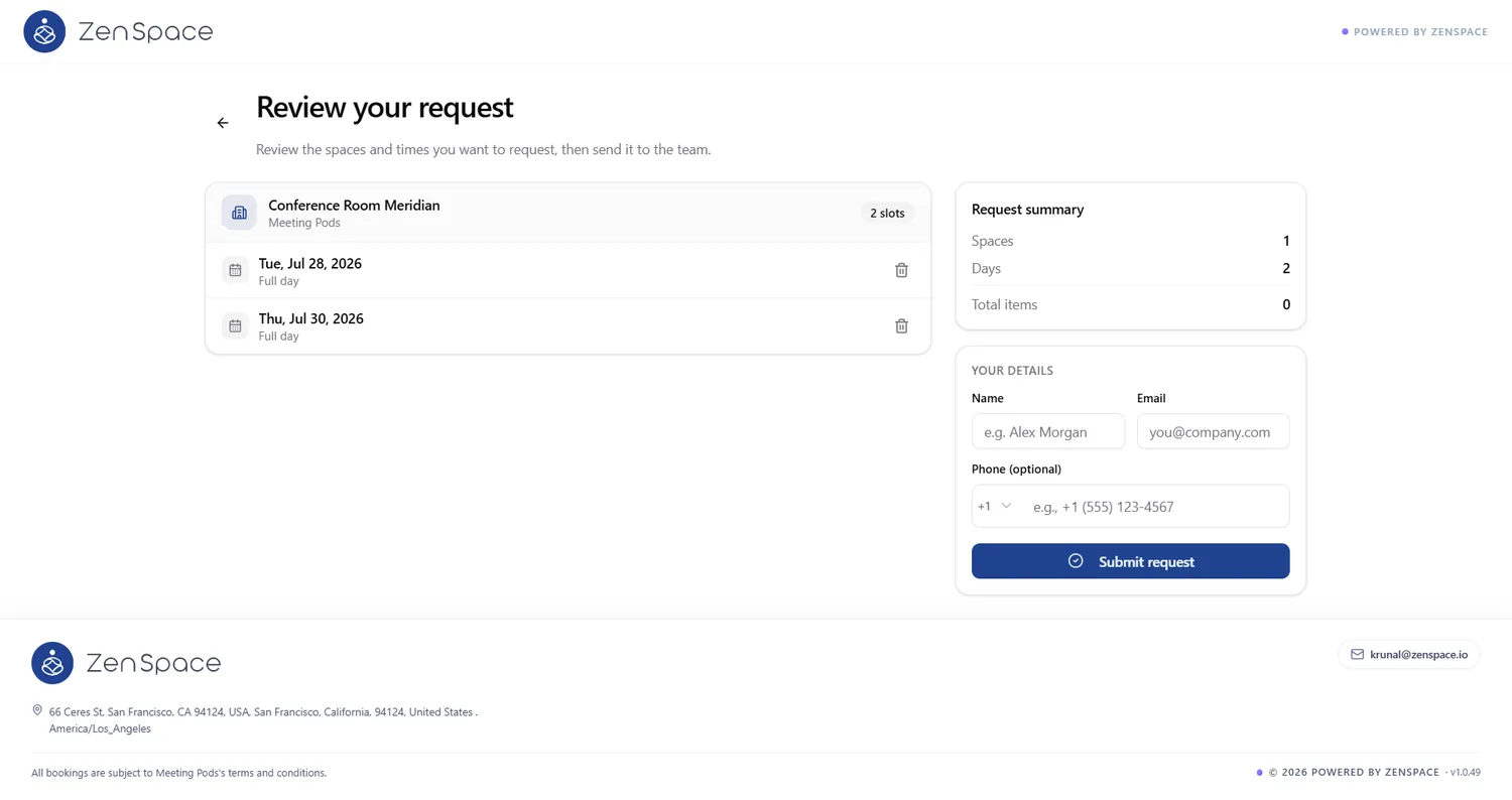
Review the spaces and times before sending the request to the team. Each space is listed with its group and a slot count, followed by its individual items — date and time window — each with a delete action.
The Request summary panel tallies Spaces, Days, and Total items. Your Details collects the requester’s Name and Email, with Phone optional behind a country-code selector, before Submit request sends the request.
📸 Review Your Request — Full Day Items
The full-day equivalent of the review screen: each item shows its date with Full day in place of a time range, and the summary reflects the number of days selected.
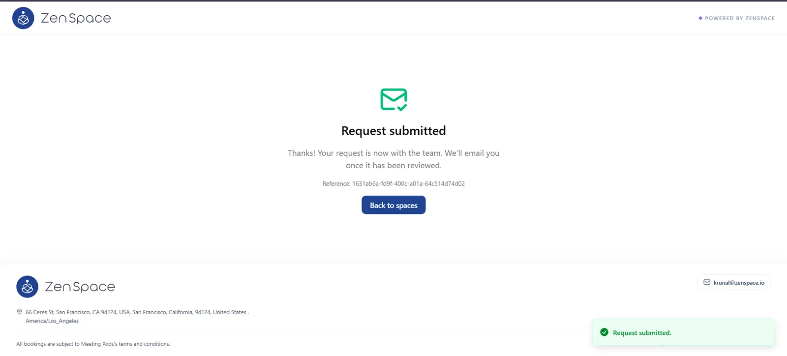
📸 Request Submitted
Confirmation screen after submitting. The requester is told the request is now with the team and that they will be emailed once it has been reviewed. A reference ID is shown for follow-up, a toast confirms the submission, and Back to spaces returns to the browse page.