Capabilities & UI Template
The Capabilities panel is where you configure what this device can do and how its UI renders. The exact controls inside depend on device type — what you see for a door looks different from what you see for a WiFi AP.
What Capabilities Control
When ZenEdge cloud (or anything else) calls the adapter’s contract API to ask “what can this device do?”, the adapter returns a list driven by what you’ve configured here. Three things together define a device’s capability surface:
- Access methods (door / reader only) — what physical authentication mechanisms are enabled on the device
- External actions — what actions are exposed for external callers (ZenEdge cloud, embedded widgets)
- UI Template — how the device’s action UI renders when requested
Two read-only blocks complete the picture: Features (what the hardware supports, reported by UniFi) and (on the right sidebar) Adapter Identity + Controller Hardware.
Access Methods (door / reader)
A checkbox list of authentication methods. Each row shows the method name and either nothing (enabled / available) or “Hardware N/A” (the physical device doesn’t support it — checkbox greyed out).
Typical methods on a UA G3 Pro reader:
The greyed-out methods marked “Hardware N/A” reflect what the connected hardware reports — a UA-Lite might show fewer enabled methods than a UA G3 Pro.
Toggling these here enables or disables them in UniFi Access for this door. Changes save when you click Save at the bottom of the panel.
External Actions
Checkbox list controlling which actions are exposed to external callers. The set of available actions depends on device type:
When unlock is checked, the contract /action endpoint accepts action=unlock for this device. When unchecked, the same call returns an “action not allowed” error. status works the same way.
This is where you make security decisions like “operators can unlock this door externally but not check its lock state” or vice versa.
UI Template
A dropdown that selects how the device’s action UI renders. The options depend on the device type — not every template works for every device.
For a door, you’ll typically see:
- Auto — the adapter picks a sensible default based on access methods enabled
- Button + 4-digit PIN — large unlock button with a 4-digit PIN entry above
- Button only — just an unlock button (for doors with PIN entered elsewhere)
- Card-based — different visual styling
- Custom HTML — full HTML/CSS template editor (covered in 6.5)
For a WiFi AP, you’ll see:
- Auto — default rendering
- Custom HTML — for full control
For a camera, you’ll see:
- Auto — default rendering with snapshot tile
- Custom HTML — for full control
Pick a template, click Preview to see it render in the UI Preview panel below, then click Save when satisfied.
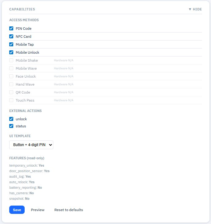
Figure 11 — Capabilities panel for a door: Access Methods, External Actions, UI Template dropdown (Button + 4-digit PIN selected), read-only Features
Custom HTML Templates
Selecting Custom HTML in the UI Template dropdown replaces the preset rendering with full editorial control. A code editor appears with the current template HTML.
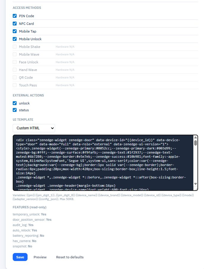
Figure 12 — Custom HTML template editor: full HTML/CSS with template variables, max 50KB
Template variables you can use inside the HTML (interpolated server-side when the template renders):
The hint below the editor reads:
Variables: {pin} {pin_digit_1}..{pin_digit_8} {device_name} {device_brand} {device_model} {device_id} {device_type} {mode} {config_json} {adapter_version}. Max 50KB.
Common patterns:
- --zenedge-primary, --zenedge-bg, --zenedge-text, --zenedge-border, --zenedge-success, --zenedge-text-muted — CSS variables for theming so your template fits the consuming page
- Wrap everything in a .zenedge-widget class with data-device-id, data-device-type, data-mode, data-role, data-zenedge-ui-version="1" attributes for downstream tools to identify your widget
Use Preview to render the template against current device data. Reset to defaults discards your custom template and reverts to a preset.
Features (read-only)
A block listing capabilities the hardware reports it supports. For a door:
Each shows Yes or No. These are informational — you can’t edit them, but they explain why some access methods or external actions might be greyed out.
Save / Preview / Reset to defaults
The button row at the bottom of the Capabilities panel:
- Save — commits your changes (Access methods, External actions, UI Template) to the adapter database. Until you click this, edits are local to the form.
- Preview — renders the current configuration (including unsaved changes) into the UI Preview panel below. Useful for testing a Custom HTML template before saving.
- Reset to defaults — discards all your edits and restores the type’s defaults. Confirmation prompt before applying.
The UI Preview Panel
Below the Capabilities panel, the UI PREVIEW panel renders exactly what ZenEdge cloud will embed for this device. It’s a live test bench.
Controls along the top of the panel:
- Action dropdown — pick which action to preview (Unlock, Status, etc., depending on enabled External Actions)
- Role dropdown — External or Internal (some controls only render for Internal)
- Sample PIN field (door templates with PIN) — type a sample value to see PIN digits render
- Device frame: Desktop / Tablet / Mobile — switch the viewport size to verify your template looks good on each
- ↻ Refresh — re-render after changing configuration
Below the controls, the rendered HTML appears in a sandbox frame. The footer of the rendered widget shows “Zenspace-iOT Adapter Version: 2.1.8” and a Check Update button (just informational — the real update flow lives on the System page).
Below the preview, a label reads “This is what ZenEdge cloud embeds for this device.”
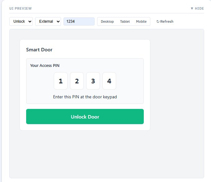
Figure 13 — UI Preview panel: Action and Role dropdowns, sample PIN, device frame toggles, and the rendered widget
About defaults: the values you choose for Action, Role, etc. in the preview controls aren’t saved as defaults — they’re for testing. The actual default that ZenEdge cloud receives is determined by the Capabilities + UI Template + Settings you saved.
Capability Visibility Rules
Two rules that matter for understanding why a UI looks the way it does:
External vs Internal role: when ZenEdge cloud requests role=external, the adapter hides any actions you didn’t tick in External Actions. With role=internal, all actions show. This is how you keep an “operator unlock” button visible to staff but hidden from guests.
Generic labels for external: external rendering uses your friendly name only — no UniFi model name, no MAC, no internal IDs. Internal rendering can expose technical detail.